A speech logo![]()
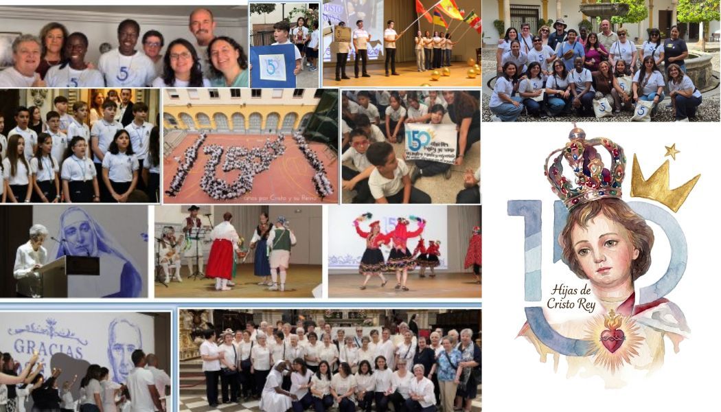
The jubilee logo of the 150 years of the Institute of the Daughters of Cristo Rey encloses in its design a deep symbology related to the history, charisma and spirituality of this religious institute founded by the priest and canon José Gras and Granollers in 1876 in Granada.
What this logo means us
1. The number 150
The central number in the design highlights the commemoration of the 150 years of life of the institute. Its modern style, with clean and balanced lines, evokes stability, continuity and projection towards the future.
- The "1" in Clear Azul represents the humble beginnings of the Institute in Granada, when Joseph Gras, moved by his desire to repair the sovereignty of Christ, shaped this evangelizing work. Its dim color reflects a nascent reality that, over time, was consolidated in a great educational and apostolic mission.
- The "5" in dark blue symbolizes the strength of the institution, its growth and firmness in the mission. Blue in several shades is the corporate color of the Institute and also currently from the José Gras Educational Foundation. This choice is based because blue is a color linked to wisdom, depth and trust, essential elements in the educational and evangelizing work of the daughters of Christ the King.
- The "0" in light blue, with an opening in its lower part and together with the "5", suggests a continuity, a path that remains open to the future. It also evokes the community dimension and the sense of unity within the institute.
2. The golden crown
The most distinctive and proper element of the Institute of Daughters of Cristo Rey, present in the logo, is the golden crown that is placed on the "0" and points to the sky. The blue and gold colors, the typography and disposition of the elements reflect the trajectory of the congregation and its commitment to the kingdom of Christ and the legacy of its founder.
The crown, the main symbol, reminds us that its mission is still alive and that the reign of Christ is an ideal to continue working.
That this logo helps us to convey the gratitude that springs from these 150 years, in which the daughters of Cristo Rey have witnessed and carriers of the message of its founder, keeping the spirit of José Gras alive and projecting his work towards the future, with the same passion and delivery with which everything began in Granada in 1876.
When contemplating this jubilee logo, we celebrate much more than a figure: we celebrate a living story, woven with the delivery and faith of those who, from Granada to the confines of the world, have responded to the dream of José Gras. Blue and gold, the crown and the warmth of writing, remind us that we are heirs of a mission that sinks its roots in the humility of the beginnings and is projected, firm and bright, towards the future.
For 150 years, the daughters of Christ the King have walked "by Christ and his kingdom", leaving a mark on education, evangelization and service, with an eye on heaven and feet on the ground, embodying the charism where life claims us. Today, gathered around this symbol, we renew our commitment to be bearers of this charisma, and work so that Christ reigns in each heart and in the entire society, with the same passion, creativity and fidelity that encouraged our founder.
May this jubilee be for us and for the whole Cristo Rey family a renewed impulse to live with joy, gratitude and hope, knowing that the mission continues and that the kingdom of God continues to make its way through our daily delivery.
We thank the path traveled and we entrust us to Mary, Queen and Mother, to accompany us and hold us in the beautiful task of continuing to build, day by day, the kingdom of Christ.